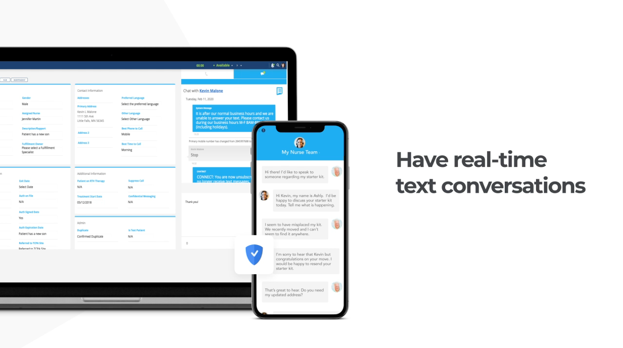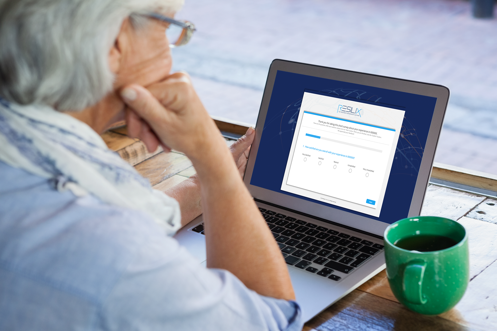

Human Care Systems, a treatment experience company located in Boston, MA wanted to design a better way for pharmaceutical manufacturers to deliver a better treatment experience for patients. Resilix provides treatment support such as phone, text, and video chat to patients and health care providers to ensure they start and stay consistent with the medications they are on. The platform is customizable to allow different manufacturers the ability have their own brand, business rules, content and communication channels configured for different users on their platform.
Building Resilix
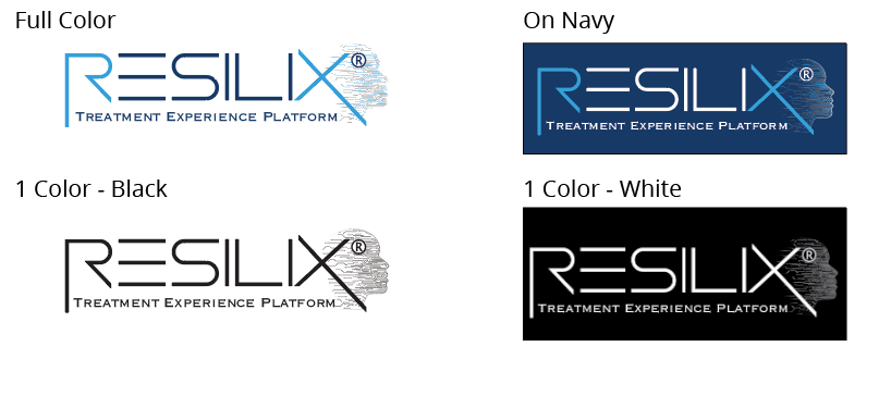
One of the very first things that was developed for Resilix was the logo. The logo and it's tagline have evolved over time but continues to compliment and support the overarching Human Care Systems logo.
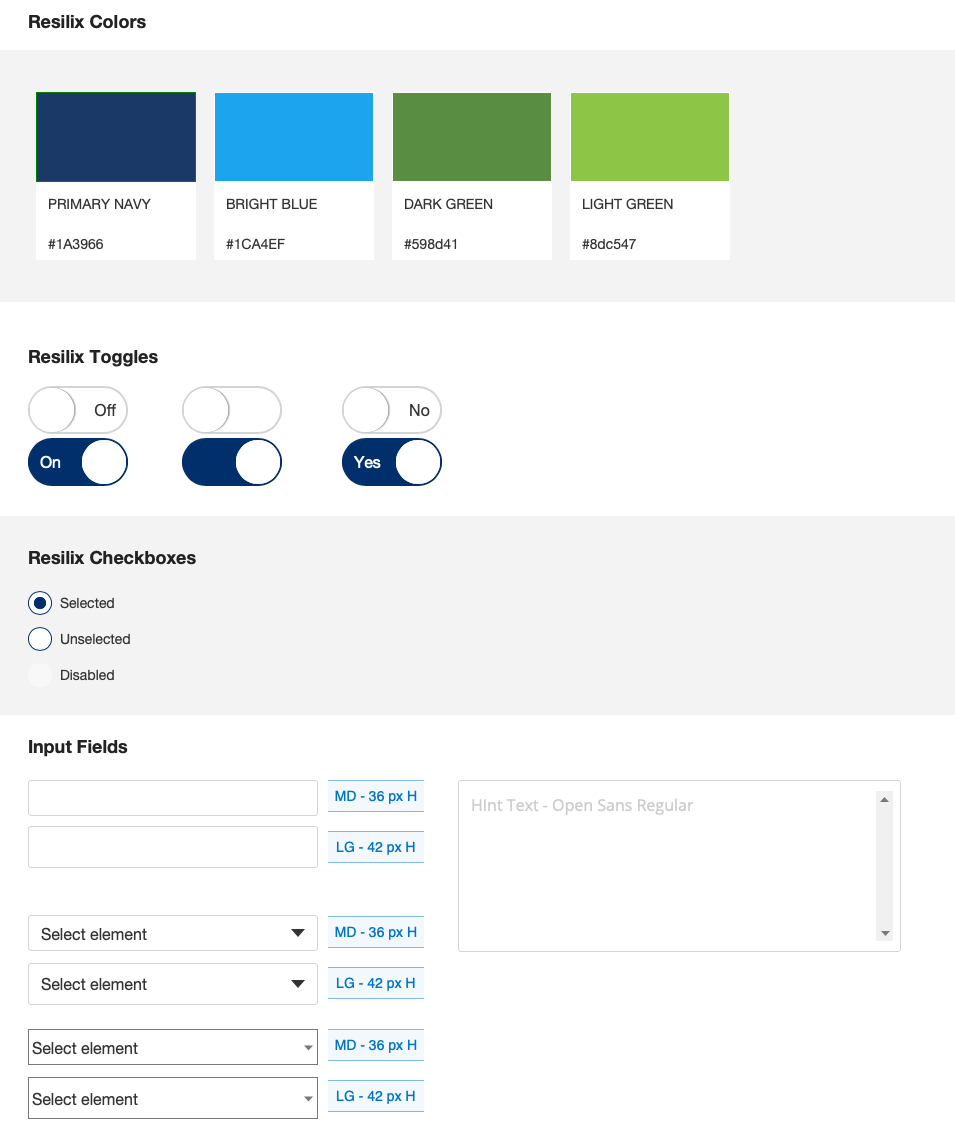
Once the logo was established and finalized, the Resilix stylesheet was created. This stylesheet was created using a variety of tools including Adobe Indesign, Photoshop & Illustrator. The color blue is perceived as trustworthy, dependable, fiscally responsible and secure which are all elements that the foundation Resilix is built on. This was the rationale for choosing two independent shades of blue as the primary colors. The primary blue evolved over time and reached a brighter shade that would show up better when used on top of the dark blue in text or iconography. The accent colors chosen were meant to fit a variety of different roles such as action buttons, danger items, or disabled elements.
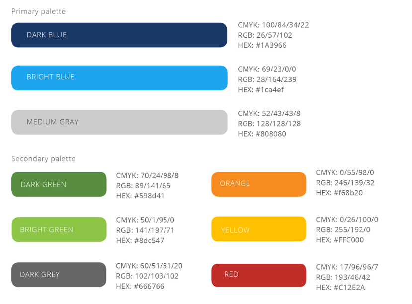
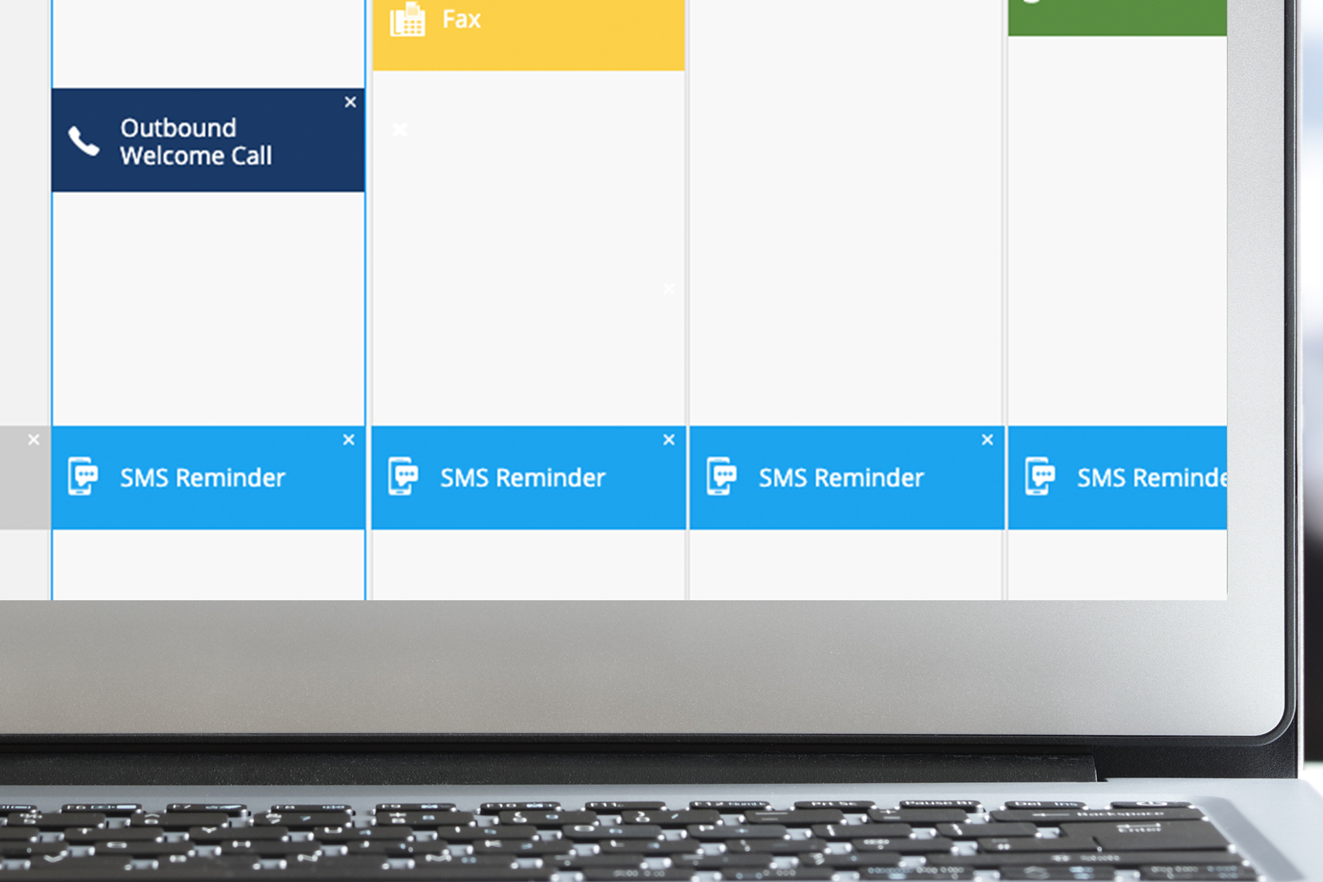
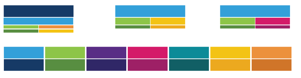
Over time, we discovered that we were in need of more colors than the original color palette. New channels such as text, fax, and video chat were being introduced and needed to be distinguished by color. The below palette shows the options chosen to date that compliment the original palette colors.
The overarching font for Human Care Systems is Open Sans. This is very web-friendly font and was chosen for it's legibility and friendly appearance. While other fonts such as Roboto and Futura were considered, the team ultimately chose to keep the Open Sans font to stay consistent with the HCS brand.

When choosing iconography for Resilix, we considered both solid and outlined icons.
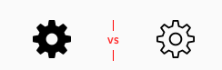
The use of icons within the platform were based on one major rule of thumb. To only be used when absolutely necessary and to in no way crowd the intended clean, elegant and minimal design of Resilix. Multiple rounds of testing with nurse users indicated the solid iconography were more recognizable and less intrusive to the rest of the design.

Design System
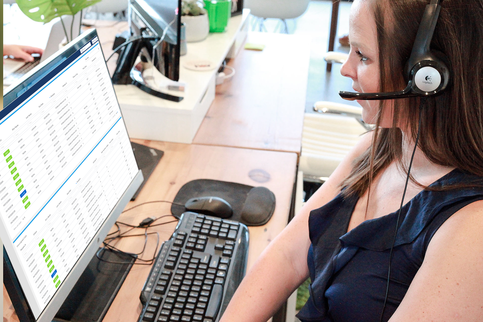
The Resilix platform is based on a the 12 column bootstrap framework. The team used elements from the Axure Bootstrap widget library to build the design system. The team of developers and designers work in an agile scrum environment using JIRA and a roadmap to launch, plan and implement all aspects of the platform. In the discovery phase prior to the launch of Resilix, it was identified that some elements of the platform would need high-level interactions, especially as new features would be introduced. After researching which prototype software would be best to convey these interactions, Axure RP was chosen because it offered more robust interactions such as inclusion of video examples, a powerful bootstrap template framework, and the ability to produce high-fidelity wireframes and prototypes that could be easily handed off to developers.
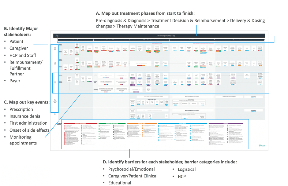
The initial phase of development used a touchpoint map to map out the patient experience from start to finish.
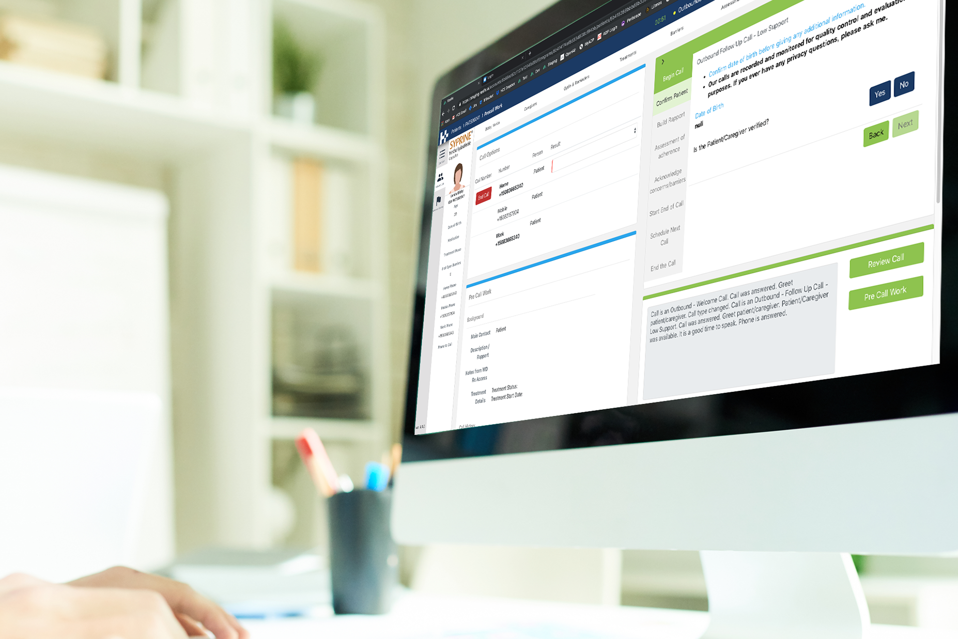
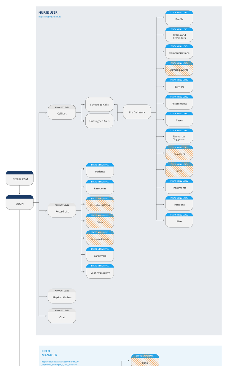
The call flow diagram is a continuous evolution and is developed for each client to show how users, such as Nurses, navigate through the platform.
A platform designed for success
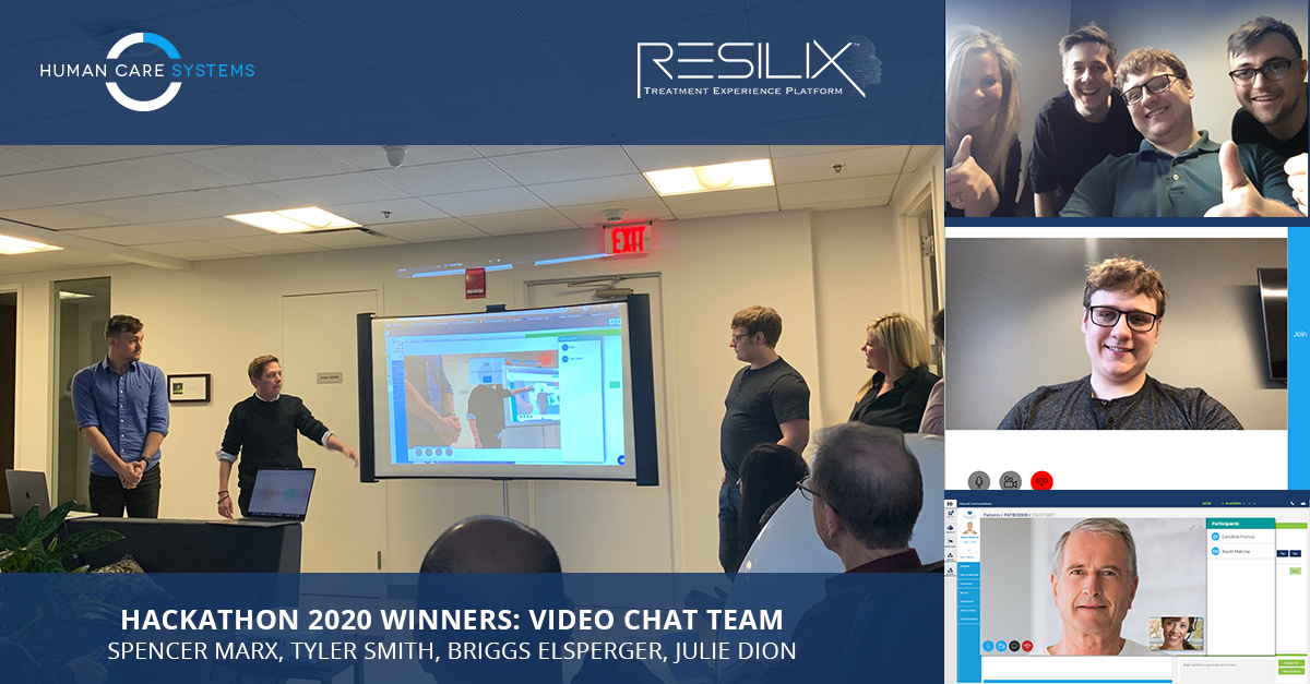
Developers, leadership, nurses and product teams have gathered several times for a week-long intensive meeting at the Human Care System Boston office to design and develop Resilix. Employees were spread into teams to expand upon new features that were presented to the entire company at the conclusion of the meeting. Prizes were awarded to the teams that did the best job on their feature and presentation.
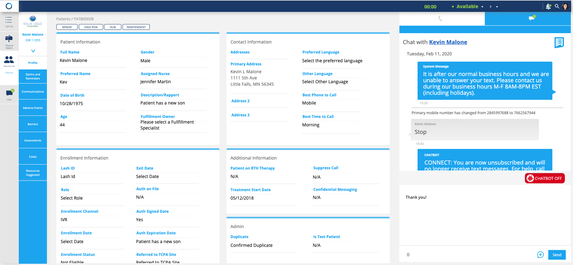
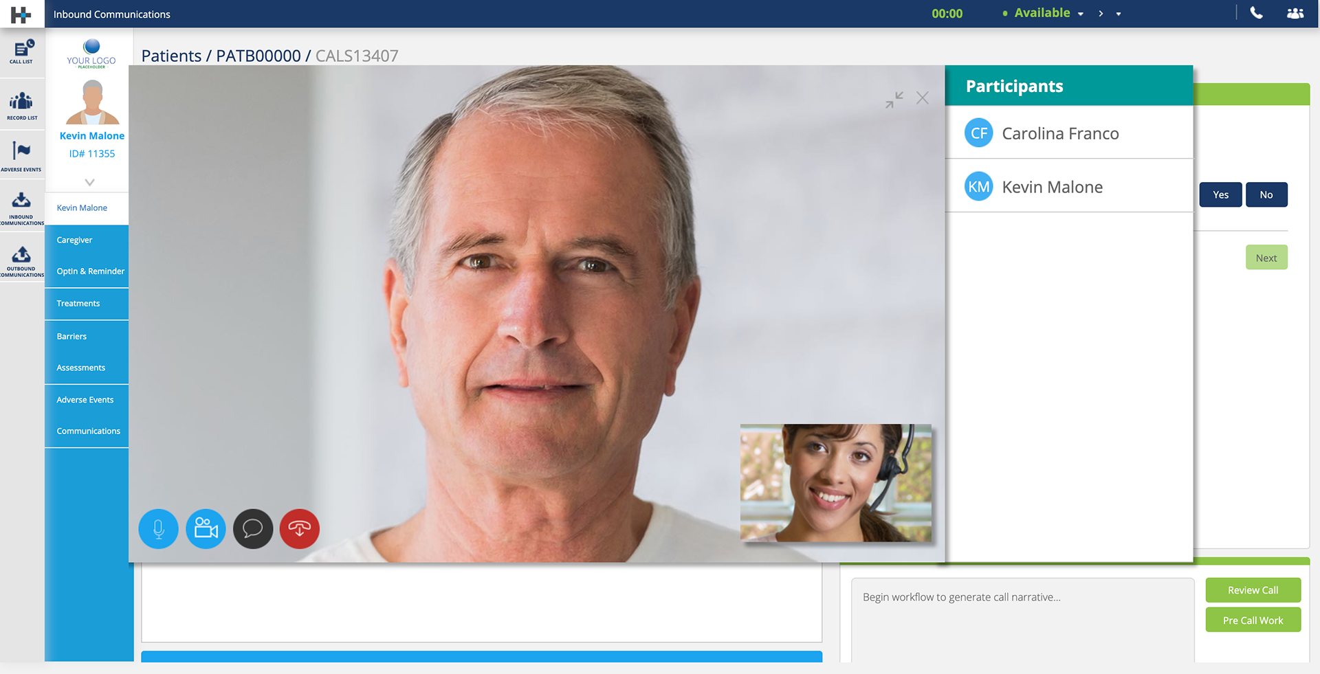
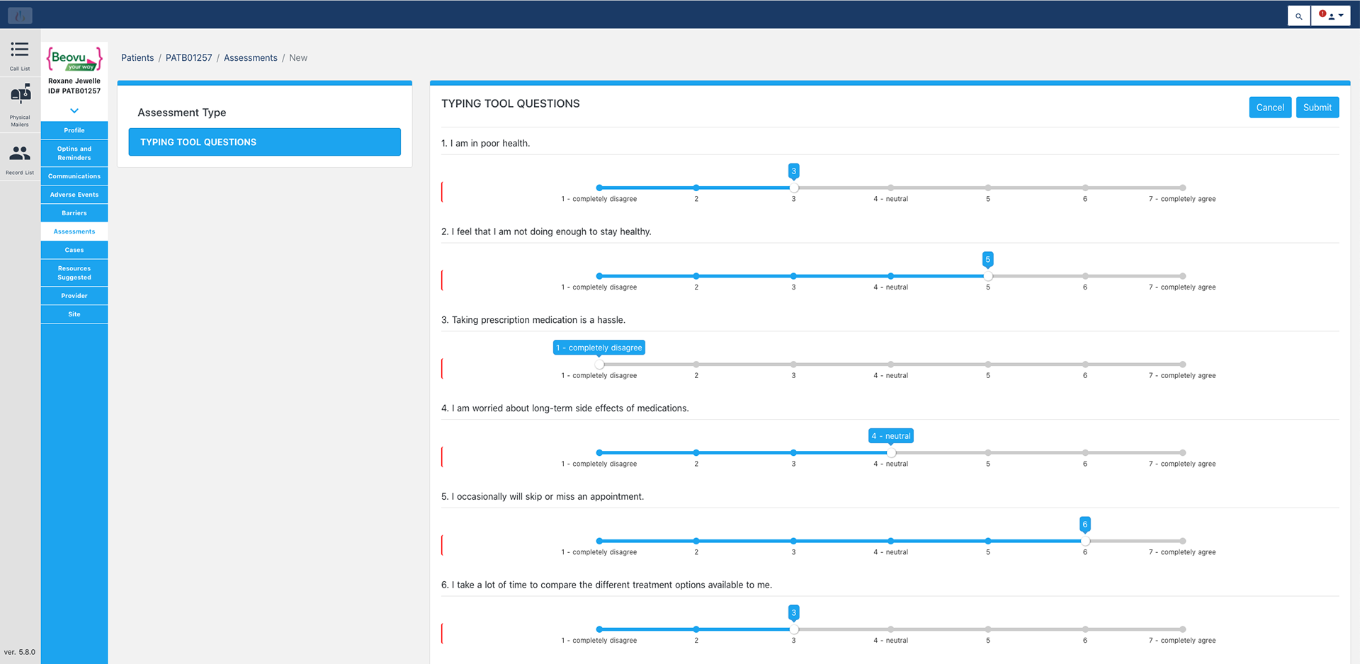
Axure was built after many hours of shadowing nurses to research how they communicated and worked with patients. Many different versions of prototypes were used, researched, and observed to obtain the most optimal interface that would provide users with the best experience to help patients. The following screens show several of the final product developed.